Brand Identity
App UI
Web & Decks
Retail Tech
/7erra
7erra was a retail startup that started during COVID. The product was a security lock for items in stores, paired with an app called StoreSlacker.
I came in as the brand and visual designer. I built the identity system, designed the StoreSlacker app, and made the company deck, the investor deck, and the website. The company never went to market, so what follows is design work rather than a shipped product.
/Role: Brand & Visual Designer
/Year: 2021
/Scope: Brand Identity | Company and Investor Decks | Website | App UI/UX | Sitemap | User Flows | Motion
The Concept
The name came from Terra, meaning ground, and the founder called the people around the brand Terrans. The logo read as an upward arrow, I built the organizing idea around that: ground to orbit. A physical store on the ground, lifted into something faster to use.
Brand Tiers
3
7erra parent · StoreSlacker product · 7erra Services.
Deliverables
5+
Brand · company deck · pitch deck · website · app UI.
App Interfaces
2
Customer-facing and employee-facing.
The mark
The mark holds three readings at once. It is a 7 and its mirror image locked into a single shape. The 7 is drawn in the form of a cursor, which points at the company being a technology company. Read whole, the shape becomes a star pointing up.
The wordmark ERRA sits on a ground line with both R's reversed. I kept the reversed letters because they tell you the brand is willing to break a convention.
The identity system
Logo construction
Symbolism
Lockups
Pattern


Color and type
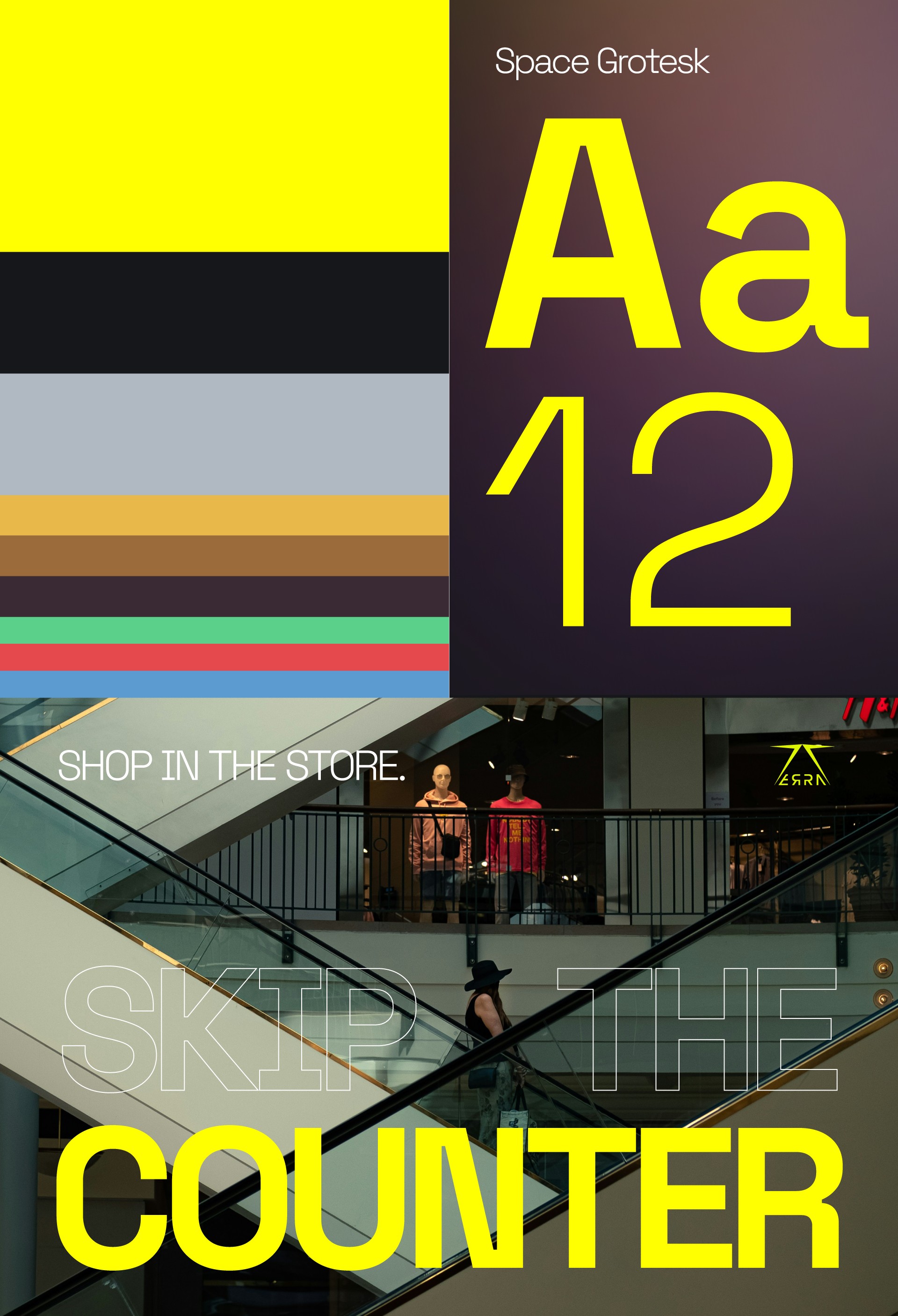
The palette runs in tiers. Lime and charcoal are primary, the Atmosphere gradient is secondary, light slate and white are tertiary, and a near-black sits underneath as the base. Lime only appears in small amounts, which is what makes it hold up against all the dark.
The StoreSlacker app
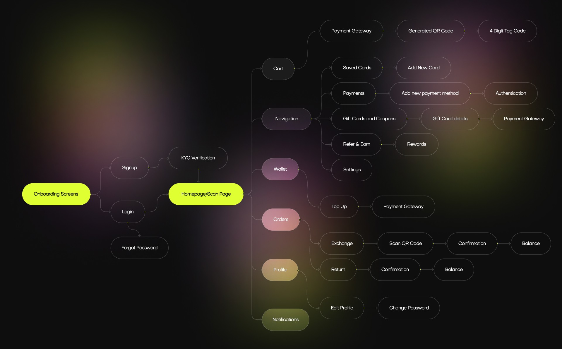
The customer app is where people scan an item, browse, pay, and unlock the tag. I built the sitemap and user flows.
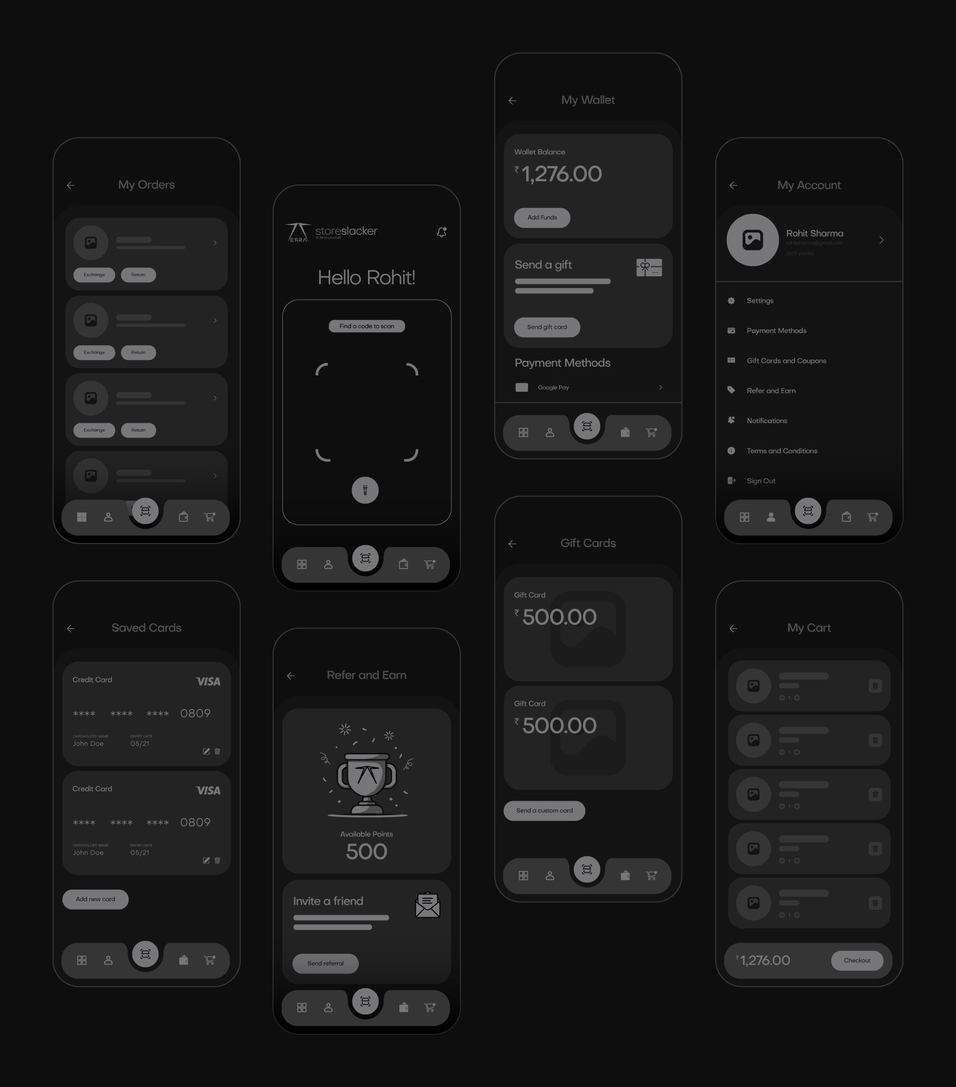
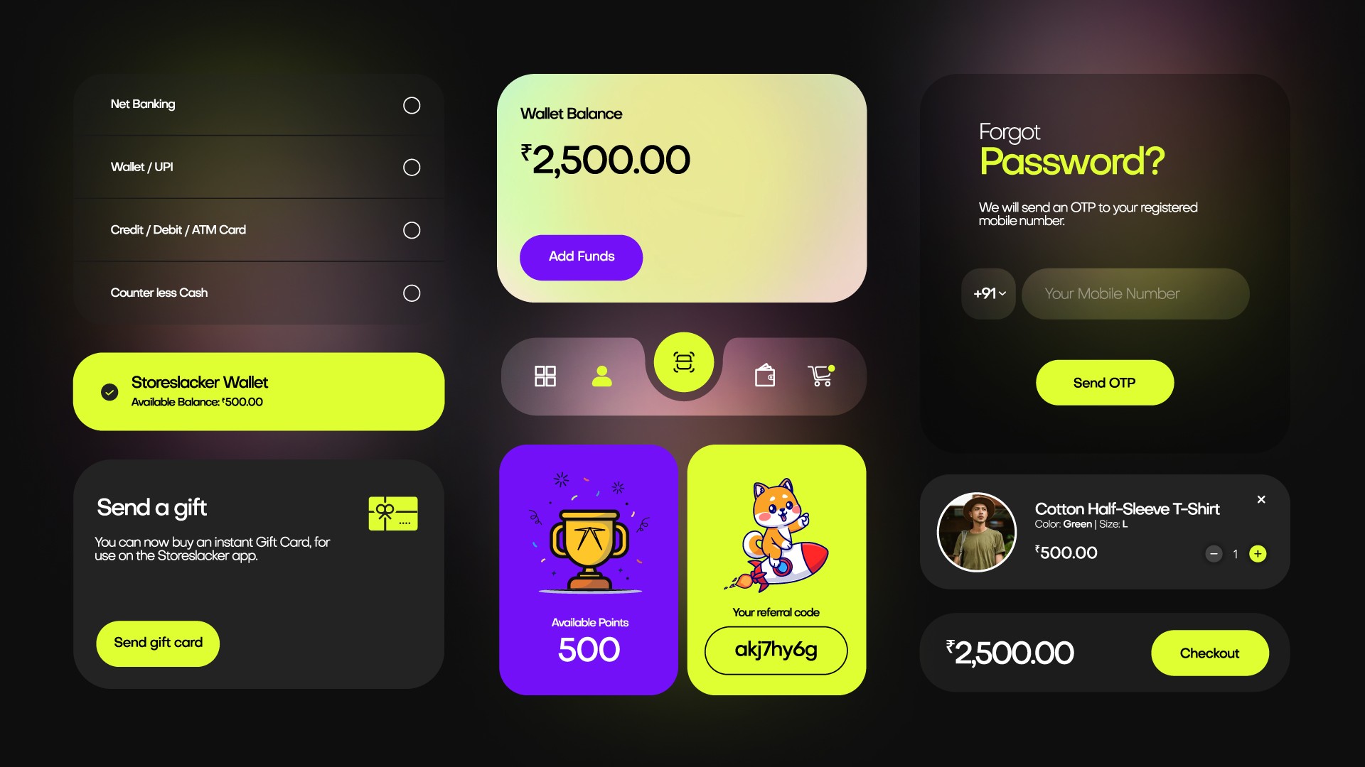
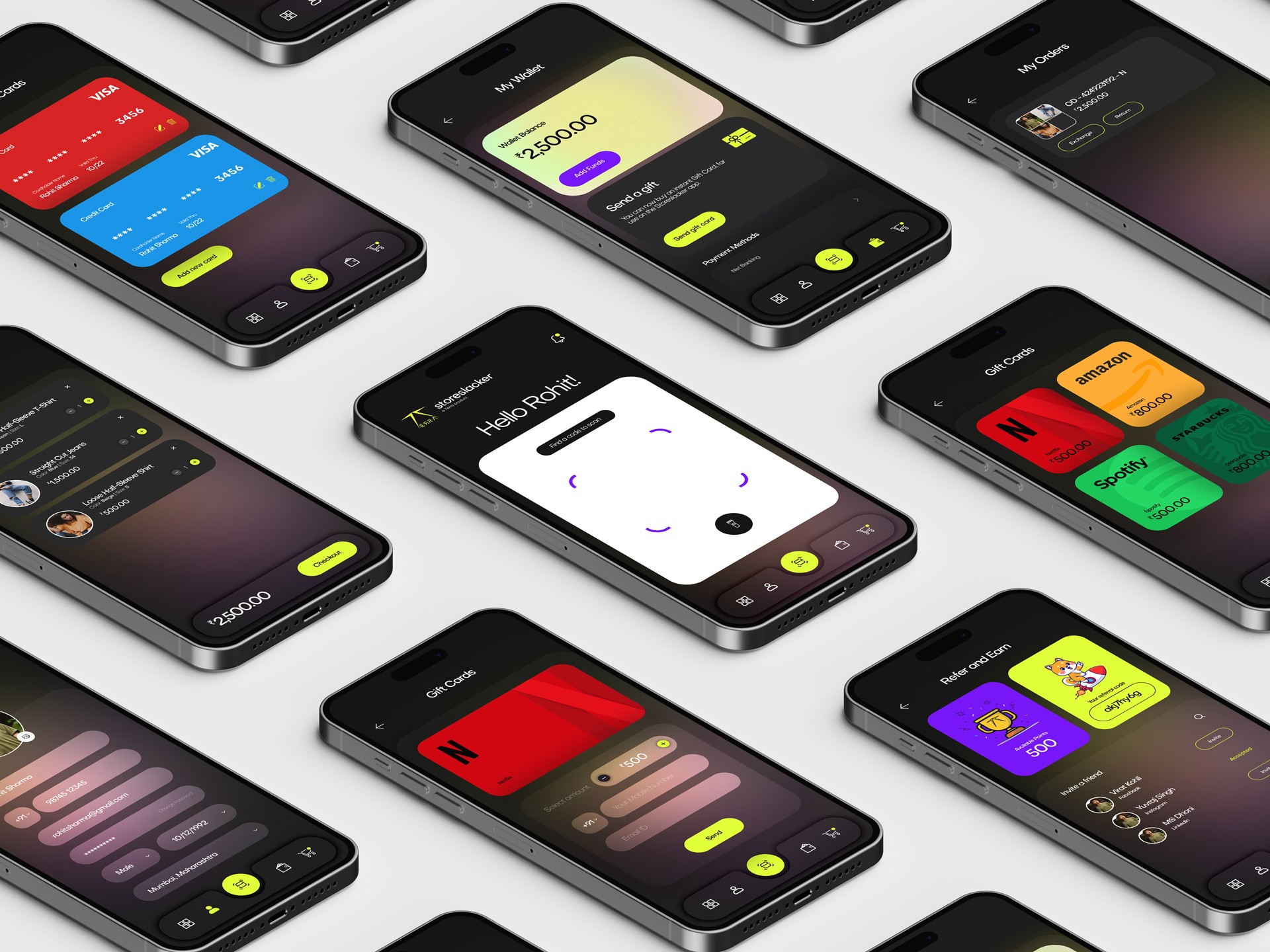
The customer app is the most developed part of this project, and it uses the warm end of the Atmosphere gradient.